Kate

Archive for March, 2010|Monthly archive page

Homepage, Landingpage, Sub-page, Sub-Sub-page

In comps, MoMA on March 29, 2010 at 11:54 am

So in continuing with the MoMA re-design fun, our class was asked to continue into the lower layers of the MoMA site. This time we are to create a landing page, sub-page, and a sub-sub-page to go along with the homepage, with a focus on the navigation. The challenge about the MoMA re-design and with most large sites, is that they have tons of content and if you’re a good web designer, you have to find an intuitive and aesthetically pleasing way for users to access all that content. The navigation also has to be consistent in keeping with the goal of aesthetically pleasing.

If you’ll recall, this is the original Home Page I redesigned from my first attempt. You can have a look at them both in this earlier post.

In keeping with the MoMA’s original design I used the modular approach for the landing page for the “Explore” section of the main navigation. I chose to categorize the main navigation as  Home, Explore, Learn, Support, & Shop. Within each main navigation category are more specific sub-categories for that particular concept. For example, Explore, expands into current exhibits, film, multi-media, exhibits, collection, & publications. I also chose to continue the Today panel onto the landing page. Since this is the landing page, it still does not include too much content, it’s like it’s name, it’s the landing in between two destinations, like in a stair well. For this assignment I opted to continue on to the film section.

Within the “Explore” section, I chose to re-design the sub-page “Film.” I included most of the original sections, “on-view,” “collection films,” “support films,” “film events,” “upcoming,” “film events,” and “library/archives.” The original MoMA page had a few more modules dedicated to specific shows currently on view, but I felt it was too overwhelming. So, actually this entire page serves as sub-navigation, which is why I included bread-crumbing about the “Today” sections. I wanted to be sure that users would be able to use the sub-navigation without having to go back to the “Film” page. I also did this with the landing page above.

Then for the sub-sub-page I chose Tim Burton’s current exhibit. I also held back on using tons of copy until you get to this stage. Once on the sub-sub-page I tried to include much more information and tried to organize it so that there were all things related to that specific exhibit. Since the user would have to wait to get to the sub-sub-page and wade through a few pages, I wanted to make sure that most related content could be found on this page. MoMA actually does this themselves and even including past events and related events & articles, I thought it was such a good idea that I stuck with it.
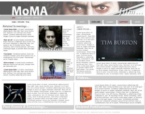
Throughout the pages the modules and content changes, but the masthead and main navigation stay the same. I also tried to make the image overlay in the masthead coincide with the content on that page.

Oh, tutorials…

In resources on March 25, 2010 at 9:57 am

Just a quickie today. Right now we’re working on developing our CSS skills. This week we are working with 2 column layouts. And to show that we are being web savvy and utilizing outside resources, here are a few good places to scope some tutorials for specific issues that you might be strugglin’ with.  My fav for today is CSS tricks. There are lots of awesome tutorials dealing with everything from 5 different ways to make rounded corners on your boxes (which is so common and a totally must-have) to building WordPress themes. I chose this faux 2 -column layout video for my tutorial pick. Check it out.

Then of course, the ever popular and useful Lynda.com. You really can find just about anything here–sometimes for free and sometimes not so much.

And we’ve also been talking about blogs and how useful they can be for continuing to learn new skills and keep up to date on the latest technologies. A few of my favorites are I Love Typography (which is about typography and not web design, but clearly important to the overall design process,) A List Apart, (which Jamie recommended) and Design*Sponge (which is about all things design, but still awesome.)

MoMA Redesign in Action

In comps, MoMA on March 18, 2010 at 9:46 am

So after my research and competitive analysis for MoMA, I’m ready to actually attempt a redesign. Here goes…

I’m sure you can figure out which one I decided to flesh out when you get further along. Honestly, I think I was having a poor foresight moment when I decided to design a page that is constructed with the navigation as the main focus. Duh…

navigation?

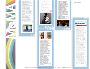
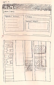
This is a great example of “…but it looks cool” design. I chose the layout that looked the most interesting to me without considering how it would really function and the user experience.  Before I get off on how wrong this design is, let me explain what I did.

I had this idea that I wanted the individual, blue panels to move up and down to reveal their content–which since I don’t at this stage have to make this page function I can dream up any kinda craziness that I want, right? I wanted the logo to stay stationary in the same location on every page for consistency and perhaps the background image to change behind the logo. I also need to mention that we were supposed to take into consideration 3 personas while designing this page.

The 3 personas, are three different people that represent people in the museums theoretical target audience. Take a look at their details and recommendations for the redesign: george_vance, theresa_lowell, & heather_adams. The long and short of it is that george likes to read and wants access to articles/printable materials, theresa is a mom that wants to organize things for her kiddos in a snap, and heather is one of us and wants it to be all shiny & designy.  In addition to there specific preferences we also have to consider the client, MoMA and their need/desire to push memberships and support/donations for the museum.  Oh and the rest of the world that might come to this site. Ready go!

So, referring to my first crack at this, I will point out a few things that I just totally did not focus on that I should have besides more intuitive navigation. The membership piece is big and I totally forgot to emphasize it. George got some of his readable content, but not necessarily printable and not in large quantities and Theresa is not really going to find her kiddy activities w/ ease.  Nobody’s happy, but it looks cool and that’s all that counts, right… just kidding!

Round 2

So after our class critique and further re-examination of the personas, I have made several important changes.

better?

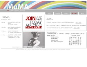
First things first, emphasize that membership, JOIN! I made it a pointto encourage the viewer not one, not two, but three different points of interest for the memberships. There’s a box in the middle of the page and two red  links in the navigation and sub navigation.  Next, our buddy George can to to the “news” section and before he goes he can get a preview of what he might find there on the first page. Then there’s the kiddos… now I don’t necessarily associate museums with children so I thought would kill two birds with one stone. In my competitive analysis I continuously referred to the access to a calendar showcasing the museums upcoming events and I access to the calendar from the first page would satisfy that need and could also include children’s events without being specifically for children. Which brings me to the “today” section. During our class critique there was some discussion for individuals to be able to login and plan their trip to the museum and though my “today” section is not that it inspired putting a panel specifically for the days events on the front page. This allows for patrons to see what’s going on today or to see what’s going on another day both from the first page. I kept the MoMA logo with the image in the background, but moved it to a more accommodating space for the rest of the layout. The navigation is more functional and could be used consistently deeper in the site which is always less confusing for the user.

Overall, I feel the second layout is a dramatic improvement over the first. And it emphasized and ever present problem with web design, just because it looks good doesn’t mean it’s easy to use or functional= possibly not worth the “coolness” factor. For next few weeks we will be further focusing on navigation, and more specifically navigation as it related to sub pages and sub-sub pages. Stay tuned…

Wireframe Extravaganza…

In tools on March 12, 2010 at 5:13 pm

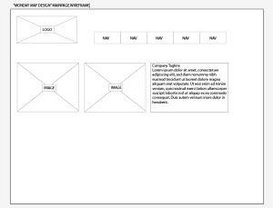
A quick word on wireframes. Until yesterday, I did not really understand what a wireframe was. To be honest they are a little confusing. Have a look at one below and tell me what you think. When you look at them they appear to be an organizational strategy for boring web page layouts, right? Actually, no. This is why they are a little tricky. They are, in fact, merely dealing with hierarchy in a visual format.

see? it's boring, which is clue #1 that it's not a layout, hopefully.

who's more important? does the wireframe give you a hint?

So the hierarchy works like this, the elements that are most important are towards the top of the page, where as the elements that are less crucial are toward the bottom. Elements that appear next to each other or around the same levels (for example the two images and copy in the “Monday May Design” main page wireframe) are of equal importance or priority. And just to muddy the waters further, it kinda makes sense that the wireframes resemble layouts because more important information appears before the fold on a web page, right? So, it makes sense that in a wireframe you would put things of higher priority toward the top of the page in the wireframe and the actual page, but higher priority doesn’t necessarily mean that it will appear further up on the actual webpage, just that it better well be there somewhere because clearly it is important. This is the most obvious with elements like logos and navigation–those are a must. You wouldn’t make a web page without a company’s logo or obvious navigation, so those will most likely appear at the top of most wireframes.

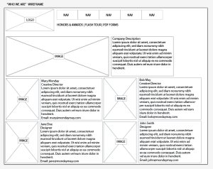
Now, back to the finer subtleties of hierarchy in less obvious situations. Have a look at the bio/image combos at the bottom of the “who we are” wireframe. It could be a safe assumption that all the bios & images are of equal value and could be arranged on the page as such. The fact that the four bios are arranged in two rows of two does not necessarily imply that they have to be laid out like that or that the top row of bios are more important than the second (or does it?) For the second aspect of that last statement, I would clarify with the team/company/client to confirm that all the bios are of equal importance. Because honestly, they could be arranged like this because all four would not fit on one row or because the top two are more important people and should be displayed as such on the webpage.

All in all, after gaining a better understanding of this particular tool I’m still not sure that it is my favorite organizational tool. They do however help you to pay attention of the priority of items on a page as per the clients specifications and lets face it, you have to be able to interpret them to give the client what they want. Wireframes are typically given to a designer at the beginning of a project by the client. The designer does not make the wireframes for themselves. They are a link between all the elements that a client wants and how important those elements are to them. So a document that solidifies those priorities is always welcomed!

Competitive. Comparative. Let’s call the whole thing off!

In MoMA, research on March 11, 2010 at 11:58 pm

As is or should be the custom, when starting a new project it’s always good to do some research. A comparative analysis if you will. However, for our class we are reading Web ReDesign 2.0 (an excellent resource) and they refer to it as a “competitive analysis.” Tom-ate-o. Tom-auto.

I decided to compare The San Francisco Museum of Modern Art, La Musée d’Orsay, La Louvre, and The Metropolitan Museum of Art. I also looked at The Guggenheim, The Whitney, The Dallas Museum of Art, The Fort Worth Modern, and The Museum of Contemporary Art, but chose to focus on the first four. Two of the four museums are french and in part I thought of them because I had been to them, but I also wanted to see what they are doing differently from the museums in the US and they are definitely bring good and bad things to the table.

First off The San Francisco Museum of Modern Art. Overall the look and feel of this site is consistent and clean. The information is readable, accessible, and laid out well. I give more details in the “Pro’s and Con’s” below.

I've been close to seeing you in person twice, but no dice.

Pro’s

  • access to membership and location info on 1st page
  • concise number of main navigation buttons
  • chart explaining benefit details
  • consistent look/feel/layout of sub-pages
  • organized calendar
  • front page presents everything before the fold

Con’s

  • flash on front page is distracting
  • color combination is drab
  • “exhibits-events” in navigation as a combination is awkward and inefficient
  • logo is bulky and lacking depth/dimension

Next is The Metropolitan Museum of Art. This is one of my least favorite sites, out of all the sites that I looked at. The background color of this site change daily? I’m not quite sure. I’ve visited it serveral times of the last two weeks and the background color changes, but not sure why or how often. In addition to that they are dense colors that make the site bulky which does not mesh well with the elegant artwork and logo. There’s a gang of navigation to wade through and it’s not even consistent throughout. There’s a ton of content here, but not enough organization to access it efficiently.  For more “pro’s and con’s” see below.

eggplant background and navagation gone awry...oh my.

Pro’s

  • location info, membership, & donation access on 1st page
  • calendar organization
  • elegant “M” graphic as part of logo

Con’s

  • no location info on 1st page
  • flat layout with left alignment that doesn’t adjust well to resizing and feels heavy on the left
  • overwhelming amount of navigation
  • sub-pages inconsistent and missing main navigation

La Musée d’Orsay is the next up to bat. This was my pick of the litter. This is a clean site with concise main navigation (only 3!) and sub navigation to make up the difference. This approach is really effective. The site also utilizes color as an organizational/navigational strategy effectively.  Visits, Events, and Collections sub pages each stick to a color to remind you what category you are in with out being overwhelming or distracting. On so many museum sites there is so much content to be organized that the navigation can get a bit heavy and Musée d’Orsay effectively manages that hurdle. La Musée d’Orsay also uses a type of user experience strategy to accommodate visitors with different needs/priorities, making key information available quickly. Check the rest of my critique below.

I love you!

Pro’s

  • simple/efficient main nav
  • user type interface for quick access to specific info
  • organized calendar
  • successful use of texture, color palette, and subtle design/graphic elements giving to feeling of sophistication and hip.
  • floor plan is in sub nav… which you don’t think you would need immediately, but is very useful
  • successful use of color for navigation/organization

Con’s

  • no location info on the first page
  • image animation/cycle is a little fast sometimes = distracting
  • membership is not very prominent (this is also the case with the Louvre, another french site, so it’s possible that their funding is such that membership is not a priority like in the US)

Now on to La Louvre. For such an elegant and classic museum, their site is a bit of a mess. There’s a wave like animation to cycle through artwork that’s kinda cheezy and an obnoxious, what looks to be a British colonist giving audio commentary about traveling through the site (Noooooooo! annoying!) On the other hand, the site uses the user tailored navigation that I liked so much in La Musée d’Orsay site and an additional user portal to plan trips and collect artwork. I have more pro’s and con’s below.

who's that little man?

Pro’s

  • everything before the fold is always good
  • user portal “my space” feature
  • user type interface

Con’s

  • that little man… in addition to being annoying, he takes up valuable real estate on the front page.
  • titles of nav are awkward (might be translation)
  • background color is unfortunate and bland and does not integrate is images on page well
  • no visual calendar

So, some did it better than others, but from my analysis, just because you are representing an institution promoting/displaying painstaking attention to nuanced details in all types of visual mediums, does not mean that your website will follow suit.


upload it to the FTP…

In specific issues on March 3, 2010 at 7:34 pm

are my least favorite words in my Web Design classes. For some reason I am filled with anxiety when I consider that my site will be out there, for all the world to see. I realize that there is a very remote possibility that anyone but my classmates and teacher will see it, but still.

Then there is the actual act of putting the files on the server. I can never manager to get the file structure right and some how the files and folders end up not where I want them. Not to mention that once up on the server, often pages don’t behave the way in which you would expect.

Luckily, I went to class, got some help from E. and drew myself a handy picture.

file structure drawing

it should look something like this

the extras has their own folders

We also talked about where to put 3rd party elements, things like spry menus and add-ons that you might get from the internet, like widgets. Apparently those things preform better when they are in their own folder. For example with my website, I used Lightbox to showcase my work, but combined with a spry accordion widget and my own css file, there were some hiccups.

In my previous site, I did not use CSS. Now, an entire class later, how could I not use CSS and for some reason I was convinced that all the CSS should be in a single sheet. Nope. After attempting to put the spry accordion, the Lightbox and my site’s CSS all into one sheet and things getting hairy, I restructured to files to look more like the drawing over there. I gave the Lightbox its own folder with sub-folders for CSS and Javascript and the spry accordion its own folder. And everyone was happy…almost.

3 page intro site…piece of cake, right?

In comps on March 3, 2010 at 7:08 pm

So for this week, we were asked to design a 3 page intro site. No problemo…

Since I am in the process of updating my website from it’s current state to a newer, shinier state*, I figured why not get some credit and feedback from my class.

(*note: I think it is inevitable that while you are learning Web Design you will quite possibly re-design your own site a ka-billion times! that’s ok though, it’s good practice.)

My current site (my first site ever) was designed with the sole intention of giving people a place to see my work and thereby get  me a job!

are you feelin' the green, me neither.

This site was an ok beginning. It had a quick animated GIF intro and then a Lightbox feature that displayed my work in a fancypants, ooow-ahhh, kinda way. However after consistent feedback from friends and no job offers, I decided to give it another go.

The feedback that I got was that the intro was annoying, the navigation was a little awkward, and the logo was a little feminine for the image that I wanted to project. Duly noted.

So I re-designed the site with those considerations in mind. Also, as I mentioned earlier, as you learn new techniques it difficult not to just use them all at once, together, in the same monster of a site because you’re excited about what you’ve learned and you want to see if it will work. Restrain yourself.


new homepage, note the advice taken.

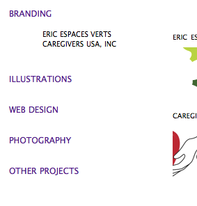
branding page

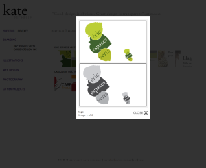
Lightbox image display gallery. Isn't that fancy?

The original site had the Lightbox gallery also, but there were other obvious differences. I decided to go for a more neutral look and feel. The original green was overpowering and not necessarily conveying the clean, fresh, image I want for my design image. The animated intro is a constant debate for me. On the one hand I know that most people don’t want to sit through even the shortest (30 secs) of intros, but on the other since I was looking for work, I wanted to show people that I could do that sort of thing if need be. In the end for my personal site, keeping people on the site long enough to see the work was more important to me than showing that I could make an intro.

On to the challenges. With a new look and layout, there comes new challenges. The navigation was another major point of contention. I wanted people to easily get to any category of work quickly without having to navigate through too many other pages. What’s that– the “two click rule?” (a user should not have to click more than twice to get to the desired content) Whatever it is, I was breaking it. So, I replaced the top bar navigation with a side bar, spry accordion navigation. I wanted the sub-categories for the pieces being show to slide down from the main category.

why is the navigation purple? i dunno.

It’s working ok for now, but I’m not sure that it is the most efficient way of doing this. Also, in case you haven’t noticed…I have…why is the navigation purple. One of the new issues that has arisen is that despite my setting the CSS for the accordion to another color, the active state and sometimes the link state while using Safari is purple. lame. I’m going to have to further investigate that one.

Then my third and final situation was uploading to the FTP. I’ve done this for my own site and a few times in previous classes, but it always trips me up. Feel free to check out an entire post on that topic.

All in all though, I am happy with my design revisions. Even though this site was only required to be three pages, with no real specified parameters, I chose to use my current personal site and invite comments. Go check it out, it’s up live now www.katemichelle.com

web design III: the final frontier

In Uncategorized on March 3, 2010 at 5:22 pm

Hello All!

I just wanted to give a quick run down of what we’re up to here on this blog–and yes, when I say “we” I am referring to myself and the rest of the kingdom…? Anyway, this is my process blog for a Web Design course at Santa Monica College. I’m not exactly sure how exciting this one will be, but there will be challenges, mistakes, and frustration–all the makings of reality TV or a blog about learning to design for the web.

So in short, I will do my best to explain what I’m working on and how I’m doing it–I’m sure with particular focus on the parts that are challenging because that’s how I learn. Hopefully, you’ll learn something too or maybe just take some solace in the collective frustrations of embarking on a new path.